


Smartpatient Brand Guidelines
Welcome to the official smartpatient brand resource.
Here you’ll find everything you need to use our brand assets correctly and consistently. For any questions or special requests, please contact us at marketing@smartpatient.eu.
This guide defines the visual language, design principles, and tone that create a clear, consistent smartpatient experience across all teams and touchpoints.
We build digital health solutions for leading pharmaceutical partners—combining medical-grade quality with user-centered design. Our brand reflects our core values: clarity, trust, and evidence-based communication.
These guidelines ensure every product, presentation, and message reinforces who we are: precise, reliable, and committed to improving healthcare through smart, accessible design.
01
Brand Story
Brand Story
Smartpatient is dedicated to empowering patients and pharmaceutical partners through innovative digital solutions.
Vision
The world’s strongest growing patient-centric ecosystem.
Mission
Improving patient lives every day for a healthier tomorrow.
02
Brand Name Usage
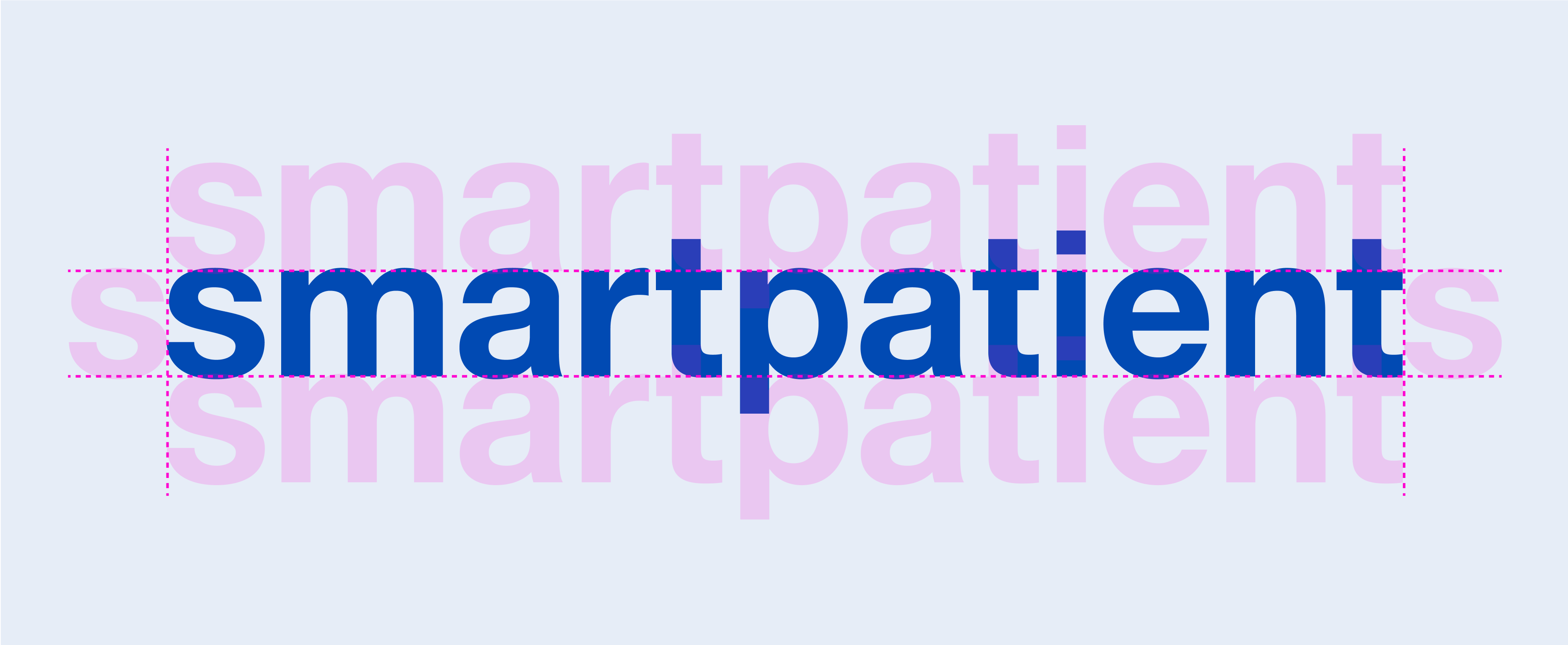
Official brand name
smartpatient
Guidelines
- Always write our name as smartpatient — all lowercase, no spaces, except for when beginning a sentence, page title, article header
- Do not capitalize any letters.
- Never abbreviate or alter the name.
Correct examples
In the middle of a sentence: "The smartpatient logo has a new look and feel."
At the beginning of a sentence: "Smartpatient is launching a new update."
In a page title or article header: "Smartpatient introduces medication reminder tool"
Incorrect examples
❌ SmartPatient
❌ Smartpatient
❌ smartPatient
❌ smart patient
Internal terminology
Smapa
Within smartpatient, the shorthand “Smapa” is used internally to refer to our employees and company culture. Calling team members “Smapa Employees” or simply “Smapa” fosters a sense of community and shared identity.
This term is intended exclusively for internal use and should not appear in external-facing materials unless specifically approved.
Using “Smapa” helps reinforce our collaborative spirit while maintaining a clear distinction between internal culture and patient- or partner-facing communication.
03
Logo Usage
The smartpatient logo features a clean, modern design that symbolizes connection, trust, and innovation in digital healthcare. Its streamlined form reflects our mission to seamlessly integrate patients, pharma partners, and healthcare providers within a unified ecosystem.
The forward motion of the logo represents progress and our commitment to advancing patient-centric solutions through technology and collaboration.Designed with precise, contemporary lines, the logo conveys reliability and expertise, while its fluidity suggests adaptability in meeting the evolving needs of the healthcare sector.
The blue color palette reinforces trust, professionalism, and clarity—core values that define every smartpatient partnership and solution.More than just a visual mark, the smartpatient logo embodies our dedication to improving health outcomes, powering digital transformation, and building lasting relationships across the healthcare landscape
3a
Primary Logo - Long version

3a
Primary Logo - Square version


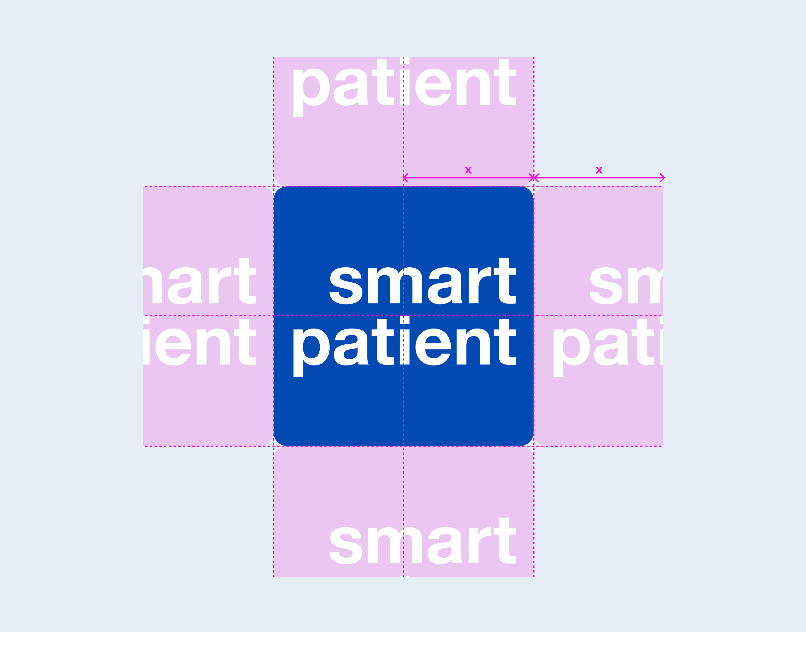
3b
Primary Logo - Square version
3b
Clearspace - Square version
3c
Secondary Logo - Long version

3c
Secondary Logo - Square version


3d
Incorrect Usage


Do not replace the color of the logo


Do not rotate the logo

Do not replace the font of the logo


Do not deform logo when resizing


Do not outline the logo


Do not add elements of create new versions of the logo
04
Color Usage
Smartpatient’s color palette is crafted to evoke trust, empathy, and clarity, reflecting our commitment to empowering patients and delivering reliable digital health solutions.
Together, these colors create a confident, approachable, and forward-thinking brand identity, ensuring smartpatient is instantly recognized as a leading partner in patient-centric healthcare innovation.
4a
Main Palette
Smapa Blue
#014AB3
Smapa Bright Blue
#2268FD
Smapa Pink
#E41C57
Redcare Red
#EE283E
Smapa Green
#5BC100
4b
Secondary Palette
Dark Blue
#002965
Light Blue
#B5CDFF
Dark Pink
#9E002F
Bright Pink
#FF92B2
Light Pink
#FFD1DF
Dark Green
#306600
Bright Pink
#AFE97C
Light Pink
#E8FFD4
4c
Blue Shades
Smapa Blue Dim 40
#012C6B
Smapa Blue Dim 20
#013B8F
Smapa Blue Light 10
#1A5CBB
Smapa Blue Light 20
#346EC2
Smapa Blue Light 30
#4D80CA
Smapa Blue Light 40
#6792D1
Smapa Blue Light 90
#E6EDF7
Smapa Grey
#A4A4A4
05
Typography
smartpatient’s typography balances clarity and professionalism with a modern yet timeless type pairing, reinforcing our commitment to precision, reliability, and patient-centric communication.
Primary Typeface
DM Sans
Primary Typeface Overview
DM Sans is the cornerstone of smartpatient’s visual identity.
As our primary typeface, it reflects the brand’s commitment to clarity, trust, and patient-first design. With its clean geometry and open shapes, DM Sans provides excellent legibility and a modern, friendly tone that works seamlessly across all digital and print touchpoints.
Usage
DM Sans is used for all smartpatient corporate communications, from headlines, subheadings, body text, website UI (e.g. buttons, navigation, other elements), to digital documents or print materials.
- Large regular or bold weights as headlines for impact and clarity
- Regular weight for body copy, app instructions, and descriptive text
Tone conveyed
Tone conveyed:
Confident, accessible, reliable—aligned with smartpatient’s mission to deliver measurable value through user-centered healthcare solutions.
Secondary Typeface
DM Serif Display
Secondary Typeface Overview
⚠️ Use DM Serif Display like a spotlight—only when you truly want to highlight something. When in doubt, default to DM Sans.
DM Serif Display is a refined, expressive typeface reserved for rare, high-impact moments in the smartpatient brand universe. It adds a subtle touch of elegance and authority, making it ideal for selected campaign visuals or strategic emphasis in print and digital marketing—not for everyday use.
Tone conveyed
Tone conveyed:
Confident, accessible, reliable—aligned with smartpatient’s mission to deliver measurable value through user-centered healthcare solutions.
Strict Usage Rules
✅ Use only for highlighting 1–3 words (e.g., values like “Impact,” “Trust,” or “Together”)
❌ Never use for full sentences or paragraphs
❌ Never use on websites or within any UI of digital products
❌ Do not use on videos, animations, or moving content (legibility risk)
✅ Allowed in print materials, digital advertisements, or static campaign visuals
✅ Acceptable for hero moments in brand campaigns (e.g., posters, banners)
Example use of DM Serif
06
Iconography
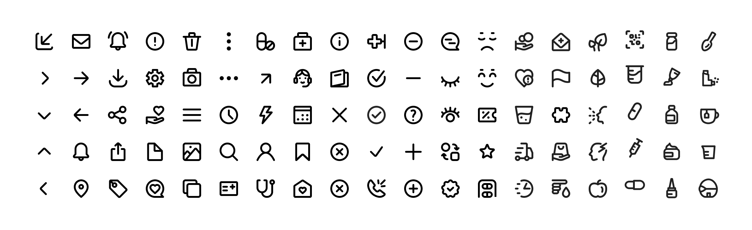
Our iconography is used for smartpatient and MyTherapy app. It’s designed to be clear, intuitive, and consistent, supporting smartpatient’s mission to deliver reliable digital health solutions for our partners. Icons are using simple outline-style, modern, and cohesive, complementing the brand’s color palette and typography.
They effectively communicate complex digital health concepts in an accessible way, enhancing clarity and engagement for our pharmaceutical partners and stakeholders.
07
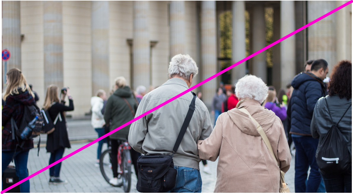
Photography
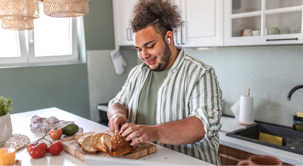
At smartpatient, photography should feel authentic, warm, and human. Our images reflect real people, real moments, and real care—never staged, never artificial. Every photo should support our mission of improving healthcare through clarity, trust, and empathy.
Use photography to connect, not impress. Prioritize natural light, soft tones, diverse individuals, and settings that feel lived-in. The goal: make every image feel like a moment worth capturing.
Style
✅ Use authentic, natural, and candid imagery that reflects real people and everyday situations. Show subtle emotions and relatable, human moments.

Style
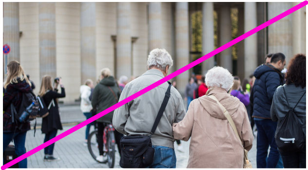
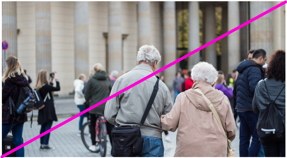
❌ Use overly posed stock photos with stiff smiles, studio-like setups, or scenarios that feel artificial.

Subjects
✅ Feature diverse individuals in realistic settings, highlighting genuine emotion, connection, and inclusivity.

Subjects
❌ Show only one demographic group, posed models, or imagery that feels stereotypical or disconnected from real user experiences.

Color and Tone
✅ Maintain a natural, balanced color palette that aligns with smartpatient’s brand. Images should feel warm, clear, and approachable.

Color and Tone
❌ Use images with heavy filters, harsh lighting, or oversaturated tones that create an unnatural look.

Composition
✅ Favor clear, uncluttered backgrounds and compositions that keep the focus on people and their experiences.
Composition
❌ Don’t use crowded, distracting backgrounds or compositions that make the subject unclear.

Usage
✅ Use photography to support storytelling across websites, presentations, and media kits, always reinforcing professionalism, empathy, and trust. Select imagery that highlights real people in real healthcare or lifestyle contexts.

Usage
❌ Don’t use photography as decoration only, choose irrelevant visuals, or mix in styles that break brand consistency.
08
Tone of Voice
Smartpatient’s tone of voice is clear, caring, and credible — grounded in empathy, integrity, and innovation. It reflects our patient-first mindset, our deep expertise in digital health, and our belief in human-centered care.
Clear
We communicate complex healthcare topics in a straightforward, accessible way. No jargon. Just clarity.
Caring
Our language is empathetic and human. We understand the challenges patients face and speak with compassion and respect.
Credible
We’re experts in what we do. Our tone is confident but never arrogant — grounded in science, facts, and real-world results.


For media inquiries, partnership requests, or questions about using our brand assets, please email marketing@smartpatient.eu.


Smartpatient Brand Guidelines
Welcome to the official smartpatient brand resource.
Here you’ll find everything you need to use our brand assets correctly and consistently. For any questions or special requests, please contact us at marketing@smartpatient.eu.
This guide defines the visual language, design principles, and tone that create a clear, consistent smartpatient experience across all teams and touchpoints.
We build digital health solutions for leading pharmaceutical partners—combining medical-grade quality with user-centered design. Our brand reflects our core values: clarity, trust, and evidence-based communication.
These guidelines ensure every product, presentation, and message reinforces who we are: precise, reliable, and committed to improving healthcare through smart, accessible design.
01
Brand Story
Brand Story
Smartpatient is dedicated to empowering patients and pharmaceutical partners through innovative digital solutions.
Vision
The world’s strongest growing patient-centric ecosystem.
Mission
Improving patient lives every day for a healthier tomorrow.
02
Brand Name Usage
Official brand name
smartpatient
Guidelines
- Always write our name as smartpatient — all lowercase, no spaces, except for when beginning a sentence, page title, article header
- Do not capitalize any letters.
- Never abbreviate or alter the name.
Correct examples
In the middle of a sentence: "The smartpatient logo has a new look and feel."
At the beginning of a sentence: "Smartpatient is launching a new update."
In a page title or article header: "Smartpatient introduces medication reminder tool"
Incorrect examples
❌ SmartPatient
❌ Smartpatient
❌ smartPatient
❌ smart patient
Internal terminology
Smapa
Within smartpatient, the shorthand “Smapa” is used internally to refer to our employees and company culture. Calling team members “Smapa Employees” or simply “Smapa” fosters a sense of community and shared identity.
This term is intended exclusively for internal use and should not appear in external-facing materials unless specifically approved.
Using “Smapa” helps reinforce our collaborative spirit while maintaining a clear distinction between internal culture and patient- or partner-facing communication.
03
Logo Usage
The smartpatient logo features a clean, modern design that symbolizes connection, trust, and innovation in digital healthcare. Its streamlined form reflects our mission to seamlessly integrate patients, pharma partners, and healthcare providers within a unified ecosystem.
The forward motion of the logo represents progress and our commitment to advancing patient-centric solutions through technology and collaboration.Designed with precise, contemporary lines, the logo conveys reliability and expertise, while its fluidity suggests adaptability in meeting the evolving needs of the healthcare sector.
The blue color palette reinforces trust, professionalism, and clarity—core values that define every smartpatient partnership and solution.More than just a visual mark, the smartpatient logo embodies our dedication to improving health outcomes, powering digital transformation, and building lasting relationships across the healthcare landscape
3a
Primary Logo - Long version

3a
Primary Logo - Square version


3b
Clearspace - Long version
3b
Clearspace - Square version
3c
Secondary Logo - Long version

3c
Secondary Logo - Square version


3d
Incorrect Usage


Do not replace the color of the logo

Do not replace the font of the logo


Do not rotate the logo


Do not outline the logo


Do not deform logo when resizing


Do not add elements of create new versions of the logo
04
Color Usage
Smartpatient’s color palette is crafted to evoke trust, empathy, and clarity, reflecting our commitment to empowering patients and delivering reliable digital health solutions.
Together, these colors create a confident, approachable, and forward-thinking brand identity, ensuring smartpatient is instantly recognized as a leading partner in patient-centric healthcare innovation.
4a
Main Palette
Smapa Blue
#014AB3
Smapa Bright Blue
#2268FD
Smapa Pink
#E41C57
Redcare Red
#EE283E
Smapa Green
#5BC100
4b
Secondary Palette
Dark Blue
#002965
Light Blue
#B5CDFF
Dark Pink
#9E002F
Bright Pink
#FF92B2
Light Pink
#FFD1DF
Dark Green
#306600
Bright Pink
#AFE97C
Light Pink
#E8FFD4
4c
Blue Shades
Smapa Blue Dim 40
#012C6B
Smapa Blue Dim 20
#013B8F
Smapa Blue Light 10
#1A5CBB
Smapa Blue Light 20
#346EC2
Smapa Blue Light 30
#4D80CA
Smapa Blue Light 40
#6792D1
Smapa Blue Light 90
#E6EDF7
Smapa Grey
#A4A4A4
05
Typography
smartpatient’s typography balances clarity and professionalism with a modern yet timeless type pairing, reinforcing our commitment to precision, reliability, and patient-centric communication.
Primary Typeface
DM Sans
Primary Typeface Overview
DM Sans is the cornerstone of smartpatient’s visual identity.
As our primary typeface, it reflects the brand’s commitment to clarity, trust, and patient-first design. With its clean geometry and open shapes, DM Sans provides excellent legibility and a modern, friendly tone that works seamlessly across all digital and print touchpoints.
Usage
DM Sans is used for all smartpatient corporate communications, from headlines, subheadings, body text, website UI (e.g. buttons, navigation, other elements), to digital documents or print materials.
- Large regular or bold weights as headlines for impact and clarity
- Regular weight for body copy, app instructions, and descriptive text
Tone conveyed
Tone conveyed:
Confident, accessible, reliable—aligned with smartpatient’s mission to deliver measurable value through user-centered healthcare solutions.
Secondary Typeface
DM Serif Display
Secondary Typeface Overview
⚠️ Use DM Serif Display like a spotlight—only when you truly want to highlight something. When in doubt, default to DM Sans.
DM Serif Display is a refined, expressive typeface reserved for rare, high-impact moments in the smartpatient brand universe. It adds a subtle touch of elegance and authority, making it ideal for selected campaign visuals or strategic emphasis in print and digital marketing—not for everyday use.
Tone conveyed
Tone conveyed:
Confident, accessible, reliable—aligned with smartpatient’s mission to deliver measurable value through user-centered healthcare solutions.
Strict Usage Rules
✅ Use only for highlighting 1–3 words (e.g., values like “Impact,” “Trust,” or “Together”)
❌ Never use for full sentences or paragraphs
❌ Never use on websites or within any UI of digital products
❌ Do not use on videos, animations, or moving content (legibility risk)
✅ Allowed in print materials, digital advertisements, or static campaign visuals
✅ Acceptable for hero moments in brand campaigns (e.g., posters, banners)
Example use of DM Serif
06
Iconography
Our iconography is used for smartpatient and MyTherapy app. It’s designed to be clear, intuitive, and consistent, supporting smartpatient’s mission to deliver reliable digital health solutions for our partners. Icons are using simple outline-style, modern, and cohesive, complementing the brand’s color palette and typography.
They effectively communicate complex digital health concepts in an accessible way, enhancing clarity and engagement for our pharmaceutical partners and stakeholders.
07
Photography
At smartpatient, photography should feel authentic, warm, and human. Our images reflect real people, real moments, and real care—never staged, never artificial. Every photo should support our mission of improving healthcare through clarity, trust, and empathy.
Use photography to connect, not impress. Prioritize natural light, soft tones, diverse individuals, and settings that feel lived-in. The goal: make every image feel like a moment worth capturing.

Style
✅ Use authentic, natural, and candid imagery that reflects real people and everyday situations. Show subtle emotions and relatable, human moments.

Style
❌ Use overly posed stock photos with stiff smiles, studio-like setups, or scenarios that feel artificial.

Subjects
✅ Feature diverse individuals in realistic settings, highlighting genuine emotion, connection, and inclusivity.

Subjects
❌ Show only one demographic group, posed models, or imagery that feels stereotypical or disconnected from real user experiences.

Color and Tone
✅ Maintain a natural, balanced color palette that aligns with smartpatient’s brand. Images should feel warm, clear, and approachable.

Color and Tone
❌ Use images with heavy filters, harsh lighting, or oversaturated tones that create an unnatural look.

Composition
✅ Favor clear, uncluttered backgrounds and compositions that keep the focus on people and their experiences.
Composition
❌ Don’t use crowded, distracting backgrounds or compositions that make the subject unclear.

Usage
✅ Use photography to support storytelling across websites, presentations, and media kits, always reinforcing professionalism, empathy, and trust. Select imagery that highlights real people in real healthcare or lifestyle contexts.

Usage
❌ Don’t use photography as decoration only, choose irrelevant visuals, or mix in styles that break brand consistency.
08
Tone of Voice
Smartpatient’s tone of voice is clear, caring, and credible — grounded in empathy, integrity, and innovation. It reflects our patient-first mindset, our deep expertise in digital health, and our belief in human-centered care.
Clear
We communicate complex healthcare topics in a straightforward, accessible way. No jargon. Just clarity.
Caring
Our language is empathetic and human. We understand the challenges patients face and speak with compassion and respect.
Credible
We’re experts in what we do. Our tone is confident but never arrogant — grounded in science, facts, and real-world results.
For media inquiries, partnership requests, or questions about using our brand assets, please email marketing@smartpatient.eu.


For media inquiries, partnership requests, or questions about using our brand assets, please email marketing@smartpatient.eu.
Smartpatient Brand Guidelines
Welcome to the official smartpatient brand resource.
Here you’ll find everything you need to use our brand assets correctly and consistently. For any questions or special requests, please contact us at marketing@smartpatient.eu.
This guide defines the visual language, design principles, and tone that create a clear, consistent smartpatient experience across all teams and touchpoints.
We build digital health solutions for leading pharmaceutical partners—combining medical-grade quality with user-centered design. Our brand reflects our core values: clarity, trust, and evidence-based communication.
These guidelines ensure every product, presentation, and message reinforces who we are: precise, reliable, and committed to improving healthcare through smart, accessible design.
01
Brand Story
Brand Story
Smartpatient is dedicated to empowering patients and pharmaceutical partners through innovative digital solutions.
Vision
The world’s strongest growing patient-centric ecosystem.
Mission
Improving patient lives every day for a healthier tomorrow.
02
Brand Name
Usage
Official brand name
smartpatient
Guidelines
- Always write our name as smartpatient — all lowercase, no spaces, except for when beginning a sentence, page title, article header
- Do not capitalize any letters.
- Never abbreviate or alter the name.
Correct examples
In the middle of a sentence: "The smartpatient logo has a new look and feel."
At the beginning of a sentence: "Smartpatient is launching a new update."
In a page title or article header: "Smartpatient introduces medication reminder tool"
Incorrect examples
❌ SmartPatient
❌ Smartpatient
❌ smartPatient
❌ smart patient
Internal terminology
Smapa
Within smartpatient, the shorthand “Smapa” is used internally to refer to our employees and company culture. Calling team members “Smapa Employees” or simply “Smapa” fosters a sense of community and shared identity.
This term is intended exclusively for internal use and should not appear in external-facing materials unless specifically approved.
Using “Smapa” helps reinforce our collaborative spirit while maintaining a clear distinction between internal culture and patient- or partner-facing communication.
03
Logo Usage
The smartpatient logo features a clean, modern design that symbolizes connection, trust, and innovation in digital healthcare. Its streamlined form reflects our mission to seamlessly integrate patients, pharma partners, and healthcare providers within a unified ecosystem.
The forward motion of the logo represents progress and our commitment to advancing patient-centric solutions through technology and collaboration.Designed with precise, contemporary lines, the logo conveys reliability and expertise, while its fluidity suggests adaptability in meeting the evolving needs of the healthcare sector.
The blue color palette reinforces trust, professionalism, and clarity—core values that define every smartpatient partnership and solution.More than just a visual mark, the smartpatient logo embodies our dedication to improving health outcomes, powering digital transformation, and building lasting relationships across the healthcare landscape
3a
Primary Logo - Long version

3a
Primary Logo - Square version


3b
Clearspace - Long version
3b
Clearspace - Square version
3c
Secondary Logo - Long version

3c
Secondary Logo - Square version
3d
Incorrect Usage


Do not replace the color of the logo

Do not replace the font of the logo


Do not deform logo when resizing


Do not rotate the logo


Do not add elements of create new versions of the logo


Do not outline the logo
04
Color Usage
Smartpatient’s color palette is crafted to evoke trust, empathy, and clarity, reflecting our commitment to empowering patients and delivering reliable digital health solutions.
Together, these colors create a confident, approachable, and forward-thinking brand identity, ensuring smartpatient is instantly recognized as a leading partner in patient-centric healthcare innovation.
4a
Main Palette
Smapa Blue
#014AB3
Smapa Bright Blue
#2268FD
Smapa Pink
#E41C57
Redcare Red
#EE283E
Smapa Green
#5BC100
4b
Secondary Palette
Dark Blue
#002965
Light Blue
#B5CDFF
Dark Pink
#9E002F
Bright Pink
#FF92B2
Light Pink
#FFD1DF
Dark Green
#306600
Bright Pink
#AFE97C
Light Pink
#E8FFD4
4c
Blue Shades
Smapa Blue Dim 40
#012C6B
Smapa Blue Dim 20
#013B8F
Smapa Blue Light 10
#1A5CBB
Smapa Blue Light 20
#346EC2
Smapa Blue Light 30
#4D80CA
Smapa Blue Light 40
#6792D1
Smapa Blue Light 90
#E6EDF7
Smapa Grey
#A4A4A4
05
Typography
smartpatient’s typography balances clarity and professionalism with a modern yet timeless type pairing, reinforcing our commitment to precision, reliability, and patient-centric communication.
Primary Typeface
DM Sans
Primary Typeface Overview
DM Sans is the cornerstone of smartpatient’s visual identity.
As our primary typeface, it reflects the brand’s commitment to clarity, trust, and patient-first design. With its clean geometry and open shapes, DM Sans provides excellent legibility and a modern, friendly tone that works seamlessly across all digital and print touchpoints.
Usage
DM Sans is used for all smartpatient corporate communications, from headlines, subheadings, body text, website UI (e.g. buttons, navigation, other elements), to digital documents or print materials.
- Large regular or bold weights as headlines for impact and clarity
- Regular weight for body copy, app instructions, and descriptive text
Tone conveyed
Confident, accessible, reliable—aligned with smartpatient’s mission to deliver measurable value through user-centered healthcare solutions.
Secondary Typeface
DM Serif Display
Secondary Typeface Overview
⚠️ Use DM Serif Display like a spotlight—only when you truly want to highlight something. When in doubt, default to DM Sans.
DM Serif Display is a refined, expressive typeface reserved for rare, high-impact moments in the smartpatient brand universe. It adds a subtle touch of elegance and authority, making it ideal for selected campaign visuals or strategic emphasis in print and digital marketing—not for everyday use.
Tone conveyed
Thoughtful, credible, premium—best used to support storytelling, not structure.
Strict Usage Rules
✅ Use only for highlighting 1–3 words (e.g., values like “Impact,” “Trust,” or “Together”)
❌ Never use for full sentences or paragraphs
❌ Never use on websites or within any UI of digital products
❌ Do not use on videos, animations, or moving content (legibility risk)
✅ Allowed in print materials, digital advertisements, or static campaign visuals
✅ Acceptable for hero moments in brand campaigns (e.g., posters, banners)
Example use of DM Serif
06
Iconography
Our iconography is used for smartpatient and MyTherapy app. It’s designed to be clear, intuitive, and consistent, supporting smartpatient’s mission to deliver reliable digital health solutions for our partners. Icons are using simple outline-style, modern, and cohesive, complementing the brand’s color palette and typography.
They effectively communicate complex digital health concepts in an accessible way, enhancing clarity and engagement for our pharmaceutical partners and stakeholders.
07
Photography
At smartpatient, photography should feel authentic, warm, and human. Our images reflect real people, real moments, and real care—never staged, never artificial. Every photo should support our mission of improving healthcare through clarity, trust, and empathy.
Use photography to connect, not impress. Prioritize natural light, soft tones, diverse individuals, and settings that feel lived-in. The goal: make every image feel like a moment worth capturing.

Style
✅ Use authentic, natural, and candid imagery that reflects real people and everyday situations. Show subtle emotions and relatable, human moments.

Style
❌ Use overly posed stock photos with stiff smiles, studio-like setups, or scenarios that feel artificial.

Subjects
✅ Feature diverse individuals in realistic settings, highlighting genuine emotion, connection, and inclusivity.

Subjects
❌ Show only one demographic group, posed models, or imagery that feels stereotypical or disconnected from real user experiences.

Color and Tone
✅ Maintain a natural, balanced color palette that aligns with smartpatient’s brand. Images should feel warm, clear, and approachable.

Color and Tone
❌ Use images with heavy filters, harsh lighting, or oversaturated tones that create an unnatural look.

Composition
✅ Favor clear, uncluttered backgrounds and compositions that keep the focus on people and their experiences.
Composition
❌ Don’t use crowded, distracting backgrounds or compositions that make the subject unclear.

Usage
✅ Use photography to support storytelling across websites, presentations, and media kits, always reinforcing professionalism, empathy, and trust. Select imagery that highlights real people in real healthcare or lifestyle contexts.

Usage
❌ Don’t use photography as decoration only, choose irrelevant visuals, or mix in styles that break brand consistency.
08
Tone of Voice
Smartpatient’s tone of voice is clear, caring, and credible — grounded in empathy, integrity, and innovation. It reflects our patient-first mindset, our deep expertise in digital health, and our belief in human-centered care.
Clear
We communicate complex healthcare topics in a straightforward, accessible way. No jargon. Just clarity.
Caring
Our language is empathetic and human. We understand the challenges patients face and speak with compassion and respect.
Credible
We’re experts in what we do. Our tone is confident but never arrogant — grounded in science, facts, and real-world results.
For media inquiries, partnership requests, or questions about using our brand assets, please email marketing@smartpatient.eu.